OneService
The one-stop community platform to meet residents’ diverse municipal needs
In order to address municipal matters and to help improve the living environment for fellow singaporeans, a community of government agencies, town councils and citizens can now partner together via the Municipal Services Office (MSO). Its objective is to improve the Government’s coordination efforts by promoting civic responsibility and community partnerships.
SCOPE
Identify user problems
Improve app experience
ROLE
UX research
User testing
Prototyping
UI design

Problem
My team was tasked to review the existing OneService app, identify user pain points and developed a solution to solve it. We had to narrow down and focus on key areas that can be addressed within such a 2 weeks time frame.
The process
Our work process revolves around four key areas and this was based on the double diamond approach by IDEO.

Competitor analysis
One thing to note was that municipal reporting apps were largely governmental initiatives, the scale is on a national level and competition within the local context is not easily available. Hence, to get a better picture of how the experience of the app will be, we did a comparison with 3 other apps. As these apps were not local, it gave us more insights into what other countries were doing and a better understanding of their cultures.

From the analysis there are some areas worth comparing:
Lesser technical functions compared to ‘FixMyStreet’ which have a map feature for reporting case.
No direct link or means to resolve urgent matters or mechanisms in place to address them.
No proper decentralization of zones or areas for reporting compared to ‘LA Unified School App’ which allows for segmented reporting. Might face issues handling cases throughout the country.
Heuristics evaluation
We conducted a heuristics evaluation using Jakob Nielsen’s framework, on the OneService app and found several issues revolving around “Flexibility and Efficiency of use” as well as “Consistency and standards”.

User flow
A flow of the current app and some of its key processes.

Initial questions
From the information gathered, we identified several areas we could work on to improve the experience of the app. Some of the key questions include:
How might we help MSO to increase community engagement?
How might we improve the features of the existing app?
How might we create a less silo experience for the app?
How might we create a system that scales up as new services get added in?
Contextual inquiry and user testing
We proceed to interview several users in order to gain more insights from their perspective of OneService and the app itself. While using the app, users were assigned tasks to complete. Their responses led to several key findings:

“Every time i tap ‘shared bicycle’ the pop up appears again and again.”
Every time a user clicks on ‘shared bicycle’ category, this annoying pop up appears. Even if you have done this before, it keeps showing up. This can be a discouraging factor as it makes the process cumbersome.
“The icon’s design and graphic illustrations looked very mismatched.”
Users felt that the interface was easy and clean but somehow there seemed to be several different style of design.


Apart of these, there were other issues that were seen being reported by the participants:
“I would only consider reporting if the issue was extremely severe.”
“I actually prefer to use other means to report issues like these.”
“Sign up process is too troublesome.”
In-depth interviews
We conducted an in depth session and was able to find out a lot more than what we know. Some of our assumptions were validated by key questions asked during the interview. Below are some of the questions that we asked the participants.

Conducting an interview with our participant, Jeremy, together with my team mate, Phoebe.

Affinity mapping
Among the groups of data collected, we noticed users’ behavior played a pivotal role in our research. There were general doubts and also several flaws surrounding the app. We were able to coordinate the findings and use this data to create our personas.

Problem statement
People are unsure of the product flow and features of the app due to design ambiguity.
If this problem is not addressed, it will continue to disrupt the app experience for all its users.
User personas
With all the research and data, we created several personas for OneService. Here are two of them:


The user journey of one of the persona:

From all the personas and their journey maps, we identified several potential areas to work on.
Feature prioritisation
Although there were several areas to tackle, our priority goes to the app experience targeted specifically towards its main purpose and functions.

Storyboarding
Storyboard for Jackson, showing him reporting a case successfully.

Lo-Fi testing
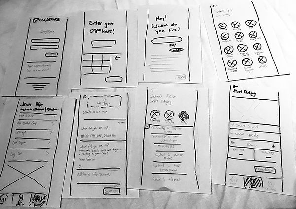
We begin by creating fast paper prototypes to run our MVP with existing users. We went ahead to test it out with our users to get some of our initial assumptions validated.

Hi-Fi prototype
Hi-fi prototype created using Sketch. This was used to conduct first round of testing.

OneService UI design kit
This was created to help adapt across new screens as we collaborate on this project.

Functional improvements

A large part of the data collected reflect poorly on the ambiguity of information for the current onboarding process. We made copy and graphic changes to address these issues.


